Lab Session 8: Matplotlib
Contents
Lab Session 8: Matplotlib
Statistics 159/259, Spring 2022
Prof. F. Pérez and GSI F. Sapienza, Department of Statistics, UC Berkeley.
04/11/2022
This is a continuation of previous lecture about Matplotlib: Beyond the basics. We will explore more matplotlib functionalities and practice how to manage plot objects. Specifically, today we will be practicing:
Basic manipulation of figures and axes
Interactive plots with widgets
Analysis of images
3D plots
Useful links:
Matplotlib: Beyond the basics, which also includes more resources.
Part 1: Matplotlib basics
import matplotlib.pyplot as plt
import numpy as np
The basic syntax consists in defining the figure and axes for every matplotlib figure we want to create. We can create a simple matplotlib figure by just attaching the plot() command to plt
plt.plot(...)
This is actually a way to tell matplotlib that we want to plot in the current axes (which we can access via plt.gca()), even when this last one has been created explicitly or implicitly. The explicit syntax for doing this will be then
    fig, axes = plt.subplots()
    axes.plot(...)
This also makes the difference between the Figure and the Axes:
Figure: The figure itself
Axes: The actual area where the data will be rendered. It is also called subplot.
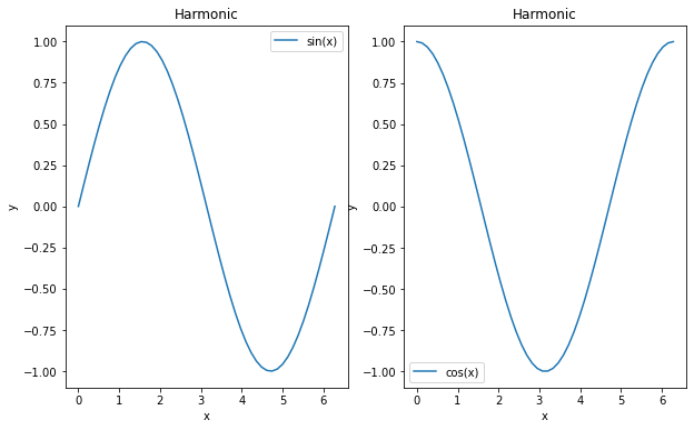
x = np.linspace(0, 2 * np.pi)
y = np.sin(x)
z = np.cos(x)

f, ax = plt.subplots(nrows=1, ncols=2, figsize=(10,6))

ax[0].plot(x,y, label='sin(x)')  # it's the axis who plots
ax[0].legend()
ax[0].set_title('Harmonic')  # we set the title on the axis
ax[0].set_xlabel('x')  # same with labels
ax[0].set_ylabel('y')

ax[1].plot(x,z, label='cos(x)')  # it's the axis who plots
ax[1].legend()
ax[1].set_title('Harmonic')  # we set the title on the axis
ax[1].set_xlabel('x')  # same with labels
ax[1].set_ylabel('y')
Text(0, 0.5, 'y')
Learn how to customize your plots
The setp() function is very handy at the moment of exploring features for your plot. When you have a matplotlib object, you can use setp() to quickly explore all the possible arguments you can change (which you can later include in the definition of such object) or set that property later using setp() too. You can do this exploration from the same notebook where you are working or (even better) open a console by pressing right-click on the notebook’s name and enter New Console for Notebook.
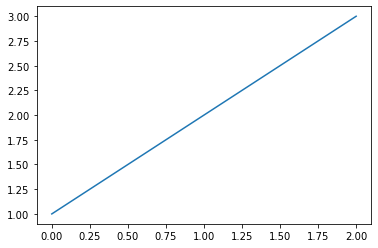
plt.plot([1,2,3])
[<matplotlib.lines.Line2D at 0x7ff534d79250>]

line, = plt.plot([1,2,3])
line
<matplotlib.lines.Line2D at 0x7ff534cedac0>
plt.setp(line)
  agg_filter: a filter function, which takes a (m, n, 3) float array and a dpi value, and returns a (m, n, 3) array
  alpha: scalar or None
  animated: bool
  antialiased or aa: bool
  clip_box: `.Bbox`
  clip_on: bool
  clip_path: Patch or (Path, Transform) or None
  color or c: color
  dash_capstyle: `.CapStyle` or {'butt', 'projecting', 'round'}
  dash_joinstyle: `.JoinStyle` or {'miter', 'round', 'bevel'}
  dashes: sequence of floats (on/off ink in points) or (None, None)
  data: (2, N) array or two 1D arrays
  drawstyle or ds: {'default', 'steps', 'steps-pre', 'steps-mid', 'steps-post'}, default: 'default'
  figure: `.Figure`
  fillstyle: {'full', 'left', 'right', 'bottom', 'top', 'none'}
  gid: str
  in_layout: bool
  label: object
  linestyle or ls: {'-', '--', '-.', ':', '', (offset, on-off-seq), ...}
  linewidth or lw: float
  marker: marker style string, `~.path.Path` or `~.markers.MarkerStyle`
  markeredgecolor or mec: color
  markeredgewidth or mew: float
  markerfacecolor or mfc: color
  markerfacecoloralt or mfcalt: color
  markersize or ms: float
  markevery: None or int or (int, int) or slice or list[int] or float or (float, float) or list[bool]
  path_effects: `.AbstractPathEffect`
  picker: float or callable[[Artist, Event], tuple[bool, dict]]
  pickradius: float
  rasterized: bool
  sketch_params: (scale: float, length: float, randomness: float)
  snap: bool or None
  solid_capstyle: `.CapStyle` or {'butt', 'projecting', 'round'}
  solid_joinstyle: `.JoinStyle` or {'miter', 'round', 'bevel'}
  transform: `.Transform`
  url: str
  visible: bool
  xdata: 1D array
  ydata: 1D array
  zorder: float
plt.setp(line, 'linestyle')
linestyle: {'-', '--', '-.', ':', '', (offset, on-off-seq), ...}
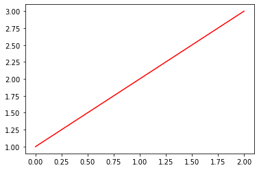
line, = plt.plot([1,2,3])
plt.setp(line, color='r');

You can do the same by
line, = plt.plot([1,2,3])
line.set_color('r')
Working with multiple axes
If we don’t specify it otherwise, the subplot will fill the full figure:
f, ax = plt.subplots()
However, we can have multiple axes/subplots in the same figure:
f, ax = plt.subplots(ncols=3, nrows=4)
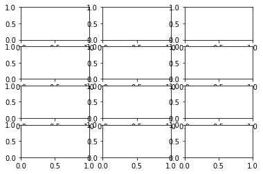
Each individual axes can be accessed as an element of a numpy array:
ax
array([[<AxesSubplot:>, <AxesSubplot:>, <AxesSubplot:>],
       [<AxesSubplot:>, <AxesSubplot:>, <AxesSubplot:>],
       [<AxesSubplot:>, <AxesSubplot:>, <AxesSubplot:>],
       [<AxesSubplot:>, <AxesSubplot:>, <AxesSubplot:>]], dtype=object)
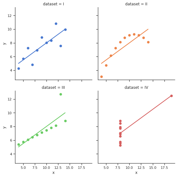
Building on top of Matplotlib: Seaborn and Xarray
Many of other libraries that provide plotting capabilities use matplotlib at a basic level. This means that we can still manipulate figures in Seaborn and Xarray as if we were working in Matplotlib. Let’s see an example:
import seaborn as sns

sns.set_theme(style="ticks")

# Load the example dataset for Anscombe's quartet
df = sns.load_dataset("anscombe")

# Show the results of a linear regression within each dataset
sns.lmplot(x="x", y="y", col="dataset", hue="dataset", data=df,
           col_wrap=2, ci=None, palette="muted", height=4,
           scatter_kws={"s": 50, "alpha": 1})
<seaborn.axisgrid.FacetGrid at 0x7ff534902c40>
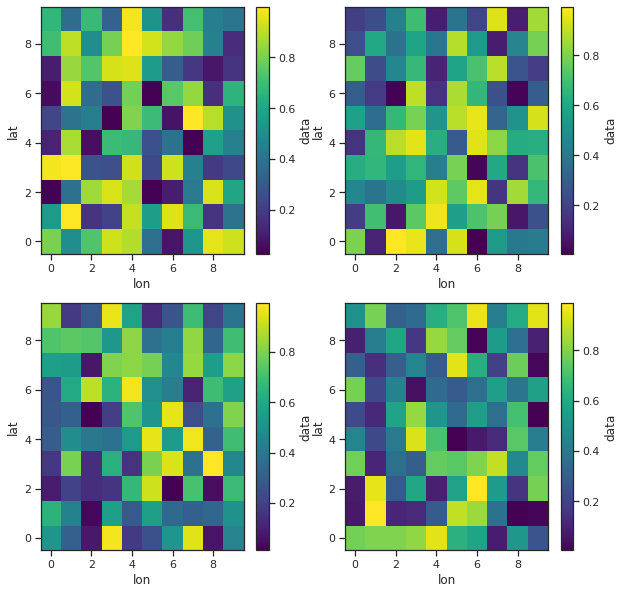
import xarray as xr

fig, axes = plt.subplots(ncols=2, nrows=2, figsize=(10,10))

ds = xr.Dataset({
    'data': xr.DataArray(
        data = np.random.rand(10, 10, 4),
        dims = ['lat', 'lon', 'time'])
        }
    )

ds.isel(time=0).data.plot(ax=axes[0,0])
ds.isel(time=1).data.plot(ax=axes[0,1])
ds.isel(time=2).data.plot(ax=axes[1,0])
ds.isel(time=3).data.plot(ax=axes[1,1])
<matplotlib.collections.QuadMesh at 0x7ff5295eaca0>
Exercise 1
Consider you have the following data in a text file (The file data/stations.txt contains the full dataset):
# Station  Lat    Long   Elev
BIRA    26.4840 87.2670 0.0120
BUNG    27.8771 85.8909 1.1910
GAIG    26.8380 86.6318 0.1660
HILE    27.0482 87.3242 2.0880
... etc.
These are the names of seismographic stations in the Himalaya, with their coordinates and elevations in Kilometers.
Make a scatter plot of all of these, using both the size and the color to (redundantly) encode elevation. Label each station by its 4-letter code, and add a colorbar on the right that shows the color-elevation map.
If you have the basemap toolkit installed, repeat the same exercise but draw a grid with parallels and meridians, add rivers in cyan and country boundaries in yellow. Also, draw the background using the NASA BlueMarble image of Earth. You can install it with
conda install basemap.
Tips
You can check whether you have Basemap installed with:
from mpl_toolkits.basemap import Basemap
For the basemap part, choose a text label color that provides adequate reading contrast over the image background.
Create your Basemap with ‘i’ resolution, otherwise it will take forever to draw.
Part 2: Understanding the structure of digital images
from matplotlib import cm

plt.rcParams['figure.figsize'] = (8, 8)
Define a function to load images:
def image_load(fname, max_size=1200):
    """
    Load an image, downsampling if needed to keep within requested size.
    """

    img = plt.imread(fname)
    shape = np.array(img.shape, dtype=float)
    sample_fac = int(np.ceil((shape/max_size).max()))
    if sample_fac > 1:
        new_img = img[::sample_fac, ::sample_fac, ...]
        print('Downsampling %sX:'% sample_fac, img.shape, '->', new_img.shape)
        return new_img
    else:
        return img
We use the %matplotlib widget magic command to see a live, zoomable version of the plots.
%matplotlib widget
fname = 'data/stained_glass_barcelona.png'

img = image_load(fname)
plt.imshow(img);
We can directly display the original file in the notebook
from IPython.core.display import Image
Image(filename=fname)
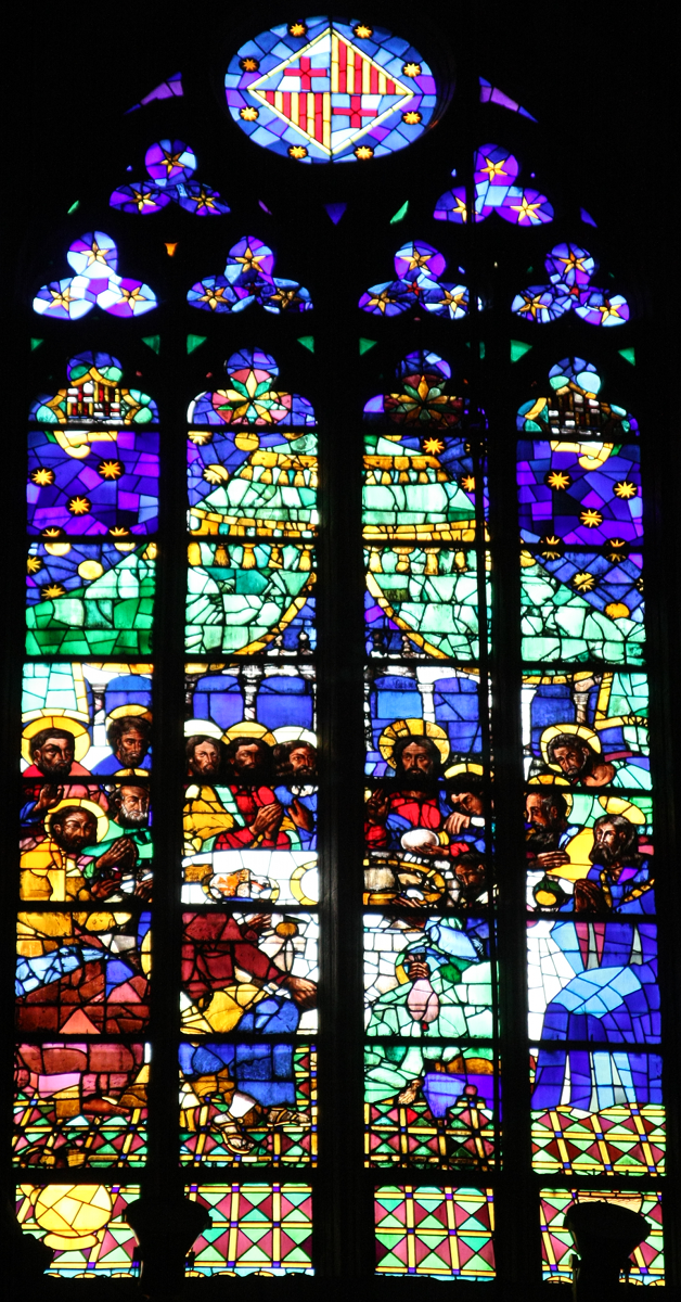
Now, the image is composed of four different channels. The first three entries in img have the intensity in the red, green and blue channels, and the last one represents the luminosity.
img.shape
(1200, 628, 4)
Exercise 2
Extract each color (RGB) channel and create a figure with 4 subplots, one for each
channel, so we can see its structure clearly. Display the full color figure and the color channels. Use imshow() for each one of the channels. Specify the colormap used for each image to match the color of the channel (for example, you can use cmap=cm.Reds_r for the first channel). Ensure that the axes are linked so zooming in one image zooms the same region in the others (you can explore the sharex and sharey here). The final plot should look something like this, were you have the option to zoom in the image.
Image(filename='data/barcelona_fig1.png')
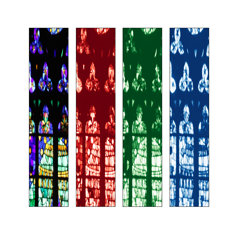
red, green, blue = [ img[:,:,i] for i in range(3) ]
Exerice 3
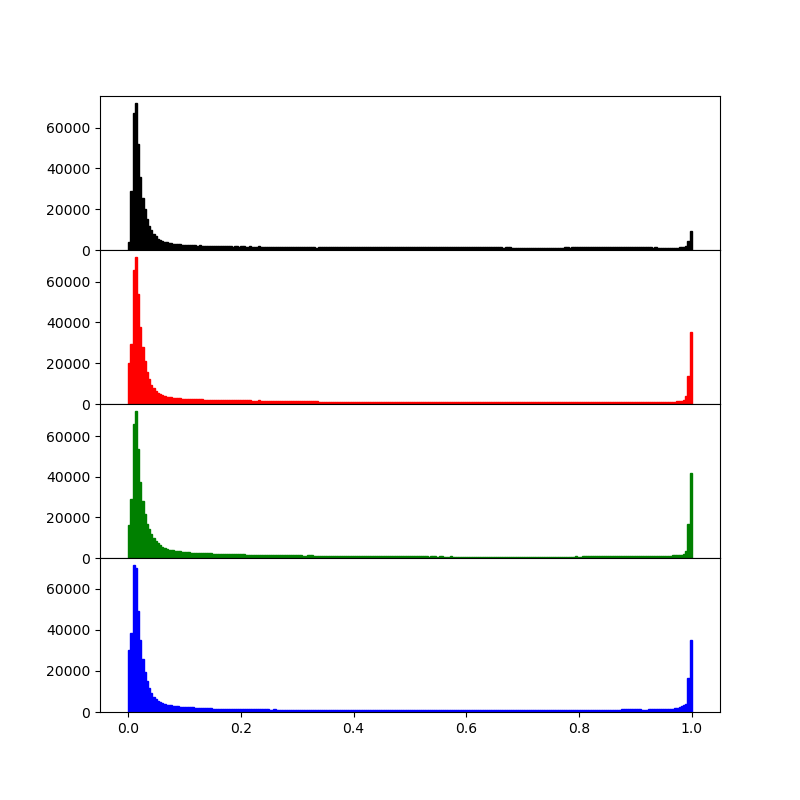
Compute a luminosity and per-channel histogram and display all four histograms in one figure, giving each a separate plot (hint: a 4x1 plot works best for this). Link the appropriate axes together.
PNG images sometimes have a 4th transparency channel, sometimes not. To be safe, we generate a luminosity array consisting of only the first 3 channels.
lumi = img[:,:,:3].mean(axis=2)
Now, display a histogram for each channel. Note that jpeg images come back as integer images with a luminosity range of 0..255 while pngs are read as floating point images in the 0..1 range. So we adjust the histogram range accordingly:
hrange = (0.0, 1.0) if lumi.max()<=1.0 else (0.0, 255.0)
The luminosity and per channel histogram should look something like this
Image(filename='data/barcelona_fig2.png')
Exercise 4
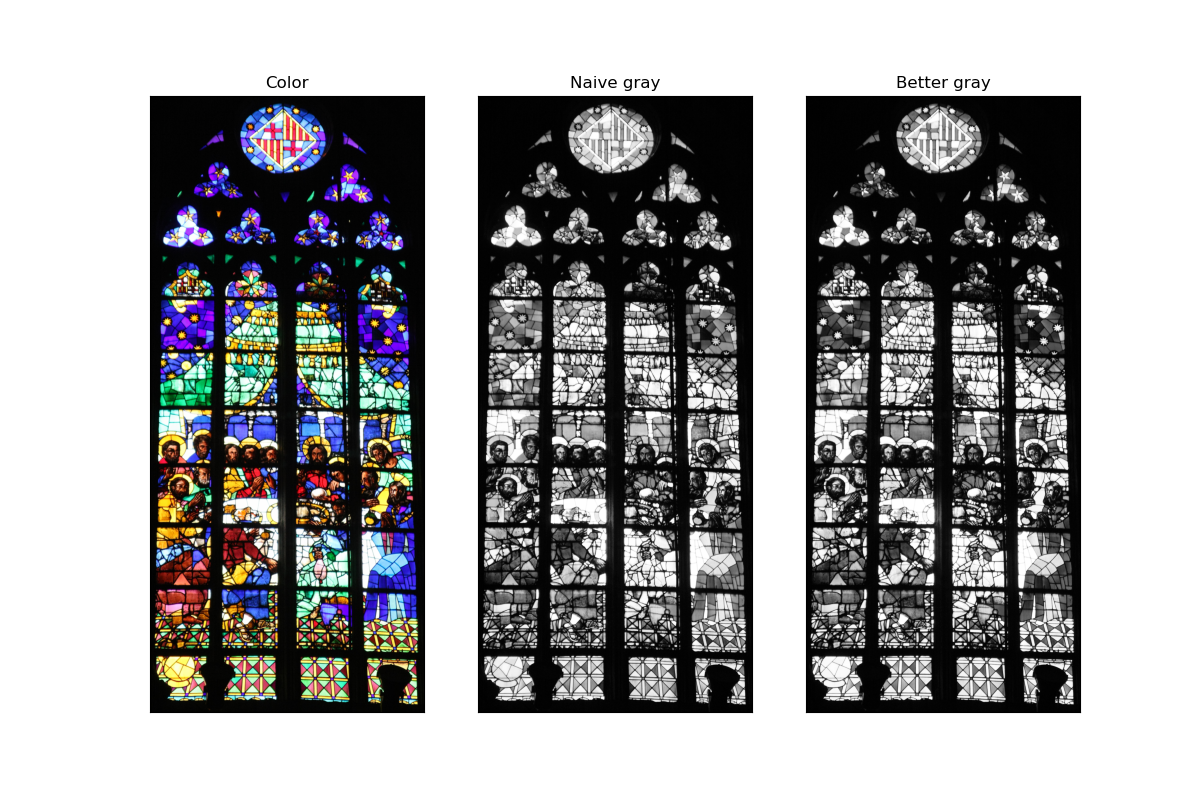
Create a black-and-white (or more precisely, grayscale) version of the image. Compare the results from a naive average of all three channels with that of a model that uses 30% red, 59% green and 11% blue, by displaying all three (full color and both grayscales) side by side with linked axes for zooming.
lumi2 = .3*red + .59*green + 0.11*blue
The final plot should look like this
Image('data/barcelona_fig3.png')
Part 3: Simple 3d plotting with matplotlib
Note that you must execute at least once in your session:
from mpl_toolkits.mplot3d import Axes3D
One this has been done, you can create 3d axes with the projection='3d' keyword to add_subplot::
    fig = plt.figure()
    fig.add_subplot(<other arguments here>, projection='3d')
A simple interactive surface plot:
from mpl_toolkits.mplot3d.axes3d import Axes3D
from matplotlib import cm

fig = plt.figure()
ax = fig.add_subplot(1, 1, 1, projection='3d')
X = arange(-5, 5, 0.25)
Y = arange(-5, 5, 0.25)
X, Y = np.meshgrid(X, Y)
R = sqrt(X**2 + Y**2)
Z = sin(R)
surf = ax.plot_surface(X, Y, Z, rstride=1, cstride=1, cmap=cm.jet,
        linewidth=0, antialiased=False)
ax.set_zlim3d(-1.01, 1.01)
(-1.01, 1.01)
And a parametric surface specified in cylindrical coordinates:
fig = plt.figure()
ax = fig.add_subplot(111, projection='3d')
theta = linspace(-4*pi, 4*pi, 100)
z = linspace(-2, 2, 100)
r = z**2 + 1
x = r*sin(theta)
y = r*cos(theta)
ax.plot(x, y, z, label='parametric curve')
ax.legend()
<matplotlib.legend.Legend at 0x7fbc2e1f1490>
Additional comments
Matplotlib is a very rich library that allow to creation of scientific figures but is also very flexible, to the point that it can be use to generate very beutiful images. There is a very nice collection of plots you can generate using matplotlib in Nicolas Rougier GH repository you can take a look at.