Analysis of CESM Scenarios to Assess Future Climate Scenarios
Contents
Analysis of CESM Scenarios to Assess Future Climate Scenarios
by Group 20 (Michael Milazzo, Jacob Jossart, and Kaichi Inoue)
Hello! Our group explored the results from climate models from the Community Earth System Model (CESM), created by the National Center for Atmospheric Research (NCAR). Please review our notebooks linked in the left menu. This notebook is mainly a general summary of our results; analysis details are in dedicated notebooks and scripts.
Many of the findings here agree well with those found in the IPCC’s Sixth Assessment Report (AR6).
from IPython.display import Image
import pandas as pd
Our data was retrieved from Pangeo, a open science community that promotes reproducable research in the Earth sciences. They provided a list of available data from CMIP. We pulled CESM data in our Pangeo_data_selection notebook.
Image('https://avatars.githubusercontent.com/u/23299451?s=200&v=4.png')

World-Wide Analysis
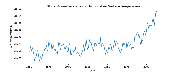
We analyzed the historical annual averages of air surface temperatures from 1850 to 2014. For most of this time, averages hovered around 287 to 287.5 degrees Kelvin. It was around the 1980s that the impact of human actions really began to increase the temperatures. Now, let’s look at the differences in predictions for varying scenarios.
Image('../figures/hist_temp_timeline.png')
Image('../figures/all_temp_timeline.png')
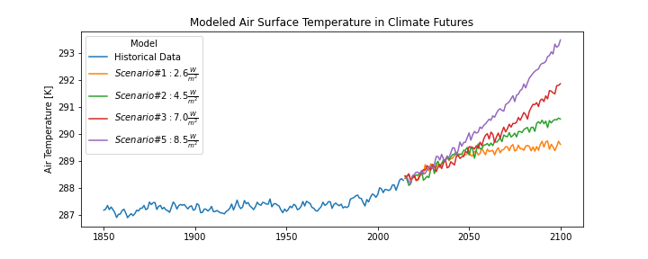
In this plot we show the historical annual averages, and then from 2015 on the predictions in four different scenarios. Scenario 1 is the best case, up to scenario 5 the worst case. These scenarios follow Representative Concentrations Pathways (RCP, in Watts per meter squared) 2.6 W/m2, 4.5 W/m2, 7.0 W/m2, and 8.5 W/m2. These future scenarios are several of those considered by the Intergovernmental Panel on Climate Change (IPCC).
In the next 3 sections we will explore the worldwide differences between each of the four models preductions (2015-2100) and historical averages (1850-1980) for Near-Surface Air Temperature, Near-Surface Specifc Humidity, and Precipitation.
Near-Surface Air Temperature
Image('../figures/ww_tas.png')
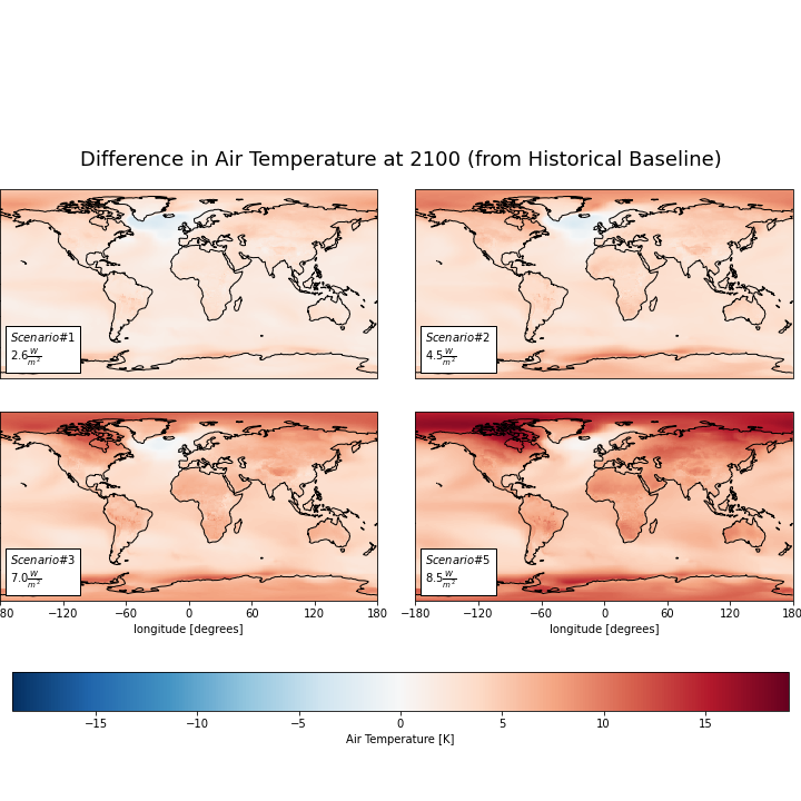
Here we have the difference between the historical average Near-Surface Air Temperature (K) and four different model predictions for the year 2100 worldwide. The lighter regions represent less change in surface air temperature, and the darker signify larger changes. We see that the Northern areas seem to have greater predicted change. This could be due to those regions initally having more snow and ice, which when melted will result in substantially less reflection (aka, albedo) of incoming sunlight/heat. This process results in this visibly larger differences in this region’s temperature than the other regions. In general, we expect increases in surface air temperature across the world, which will result in stronger and more frequent extreme wildfires, weather systems, and droughts. There is an interestingly resistant to change area around Greenland, which could possibly be due excessive glacial melt from Greenland, or from reduced heat from the Gulf Stream’s cycles (indicating a weaker Gulf Stream). A weaker Gulf Stream would cause less heat to be brought over to Northern Europe, and could result in an actual decrease in temperatures in that region, which could come with many of its own problems. Below is a summary of mean and peak air temperature values.
# Air temperature summary statistics for the four different models
pd.read_csv('../analysis_data/ww_tas.csv')
| Unnamed: 0 | sp1 | sp2 | sp3 | sp5 | |
|---|---|---|---|---|---|
| 0 | Mean | 2.7 | 3.89 | 5.41 | 7.41 |
| 1 | Max | 8.3 | 10.18 | 12.91 | 19.13 |
Near-Surface Specifc Humidity
Image('../figures/ww_huss.png')
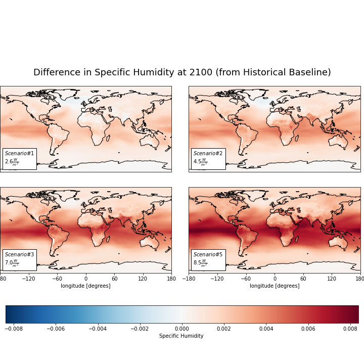
This set of plot shows us model predictions in 2100 for worldwide Specific Humidity, which is the mass of water vapor per unit mass of air. We can see an increase in humidity at the Intertropical Convergence Zone. On the plots, this is that belt of dark red around the equator. The general increase in humidity across the world could be due to evapotranspiration, amongst other natural phenomena. Below is a summary of average and maximum specific humidity values.
# Specific humidity summary statistics for the four different models
pd.read_csv('../analysis_data/ww_huss.csv')
| Unnamed: 0 | sp1 | sp2 | sp3 | sp5 | |
|---|---|---|---|---|---|
| 0 | Mean | 0.0 | 0.00 | 0.00 | 0.00 |
| 1 | Max | 0.0 | 0.01 | 0.01 | 0.01 |
Precipitation
Image('../figures/ww_pr.png')
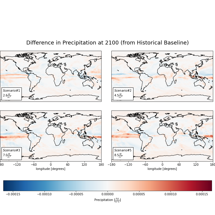
Here we have the four model predictions in 2100 for Precipitation levels (in \([\frac{kg}{m^{2}s}]\)) around the world. There are a couple of interesting patterns to address here. In the first model with least warming, we see that many of the regions just off of coastlines (and in the Atlantic) can expect a decrease in precipitation. However, the other three models predict increased precipitation. This could be due many things, which may again include evapotranspiration since the increase in heat will lead to more water being evaporated out of trees, crops, and the ground. These patterns may also be due to stronger El Niño events.
There is a very noticable red band on the equator that grows drastically darker with the severity of model. The Intertropical Convergence Zone is the region that encircles the Earth around the equator, where the trade winds of the Northern and Southern Hemispheres come together. The intense sun and warm water of the equator heats the air and water in the ITCZ, raising its humidity and making it more buoyant. We can see that as the model severity increases, the ITCZ is drastically increasing in amount of precipitaion. This can have serious implications for extreme weather events.
These predicitions were interesting to us because we usually associate climate change with heat and drought. However, water is not necessarily being lost; it’s just that the locations it is concentrated in (or not) become more extreme.
# Precipitation summary statistics for the four different models
pd.read_csv('../analysis_data/ww_pr.csv')
| Unnamed: 0 | sp1 | sp2 | sp3 | sp5 | |
|---|---|---|---|---|---|
| 0 | Mean | 0.0 | 0.0 | 0.0 | 0.0 |
| 1 | Max | 0.0 | 0.0 | 0.0 | 0.0 |
North American Analysis
In these next 3 sections we will explore the North American differences between each of the four models preductions (2015-2100) and historical averages (1850-1980) for Near-Surface Air Temperature, Near-Surface Specifc Humidity, and Precipitation.
Near-Surface Air Temperature
Image('../figures/USA_TAS_models.png')
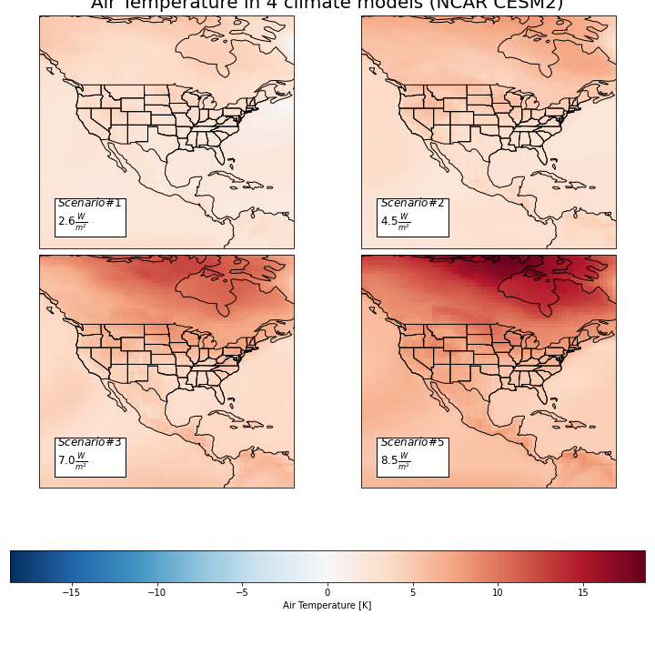
Here we have the difference between the historical average Near-Surface Air Temperature (K) and four different model predictions for the year 2100 in the North America region. The lighter regions represent less change in surface air temperature, and vice versa for the darker. We can see that the more northern areas seem to have greater predicted change. This could be due to those regions initally having more snow and ice, which when melted will result in substantially less reflection of incoming sunlight/heat. This process results in this visably larger difference in temperature than the other regions. In general, we expect increases in surface air temperature across North America, which will result in worsening wildfires, wind patterns, droughts, and more. Below is a summary of mean and peak air temperature values.
# U.S. air temperature summary statistics for the four different models
pd.read_csv('../analysis_data/usa_tas.csv')
| Unnamed: 0 | sp1 | sp2 | sp3 | sp5 | |
|---|---|---|---|---|---|
| 0 | Mean | 2.908863 | 4.069360 | 5.781022 | 7.837420 |
| 1 | Max | 5.815333 | 8.140252 | 12.699799 | 18.631414 |
Near-Surface Specifc Humidity
Image('../figures/USA_huss_models.png')
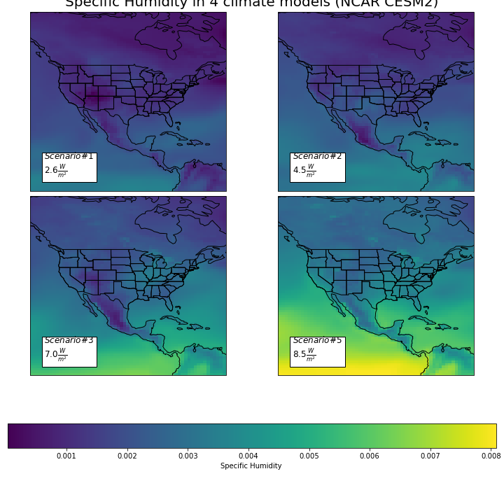
This set of plot shows us model predictions in 2100 for Specific Humidity, which is the mass of water vapor per unit mass of air. Many of the humidity trends seen here can be related to the previously discussed precipitation predictions. We can see drastic increases in humidity at the Intertropical Convergence Zone, represented on the map by the increasingly yellow line along the bottom by the equator. The general increase in humidity across North America could be due to evapotranspiration amongst other natural phenomena. Below is a summary of average and maximum specific humidity values.
# U.S. air temperature summary statistics for the four different models
pd.read_csv('../analysis_data/usa_huss.csv')
| Unnamed: 0 | sp1 | sp2 | sp3 | sp5 | |
|---|---|---|---|---|---|
| 0 | Mean | 0.001608 | 0.002107 | 0.003072 | 0.004313 |
| 1 | Max | 0.003679 | 0.003826 | 0.006504 | 0.008089 |
Precipitation
Image('../figures/USA_PR_models.png')
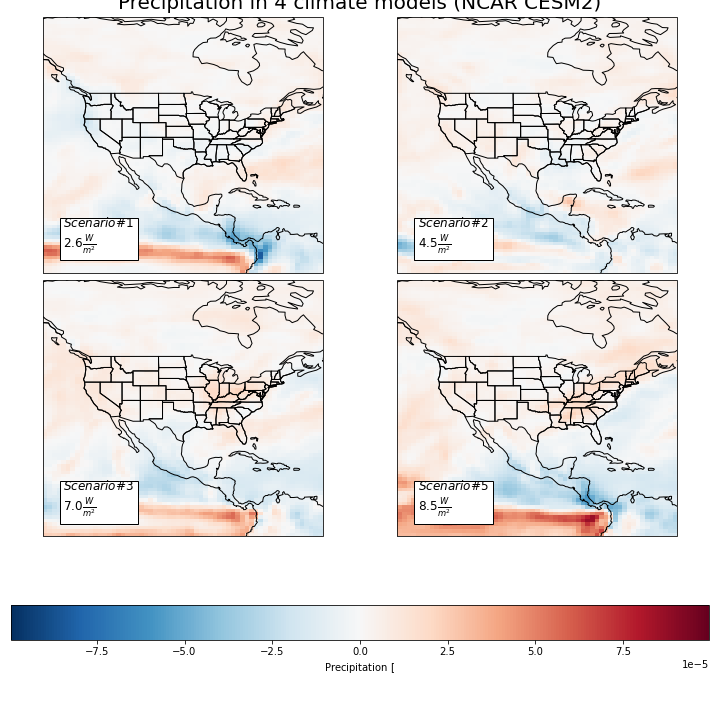
Here we have the four model predictions in 2100 for Precipitation levels (in \([\frac{kg}{m^{2}s}]\)) in the North American region. There are a couple of interesting patterns to address here. In the first, or ‘best case’, model we can see that many of the South Western regions of the United States can expect a decrease in precipitation. However, in the other three models we can increasingly see a prediction of increased precipitation. This could be due many things, of which may include a phenomenon known as evapotranspiration where the increase in heat will lead to more water being evaporated out of trees, crops, and the ground. These patterns may also be due to stronger El nino events. For all the models, Canada appears to have a steady and slight increase in precipitation while the more Southern part of North America such as Mexico can expect a gradual decrease in precipitation.
There is a very noticable red band on the equator that grows drastically darker with the severity of model. As seen above at the worldwide level, this could be the Intertropical Convergence Zone. More likely, however, is that this is evidence of stronger El Niño events in more severe climate futures.
# U.S. air temperature summary statistics for the four different models
pd.read_csv('../analysis_data/usa_pr.csv')
| Unnamed: 0 | sp1 | sp2 | sp3 | sp5 | |
|---|---|---|---|---|---|
| 0 | Mean | 4.534512e-07 | 7.872732e-07 | 0.000002 | 0.000004 |
| 1 | Max | 6.115629e-05 | 3.626463e-05 | 0.000056 | 0.000100 |
Conclusion
Our analysis led to some interesting insights in the ways Earth will change by the year 2100 due to anthropogenic climate change. By looking at four different models of varying severity, we can further see the average intensity of potential weather-relevant outcomes. We observed and discussed changes to surface air temperatures, humidity, and precipitation. In the best case scenario, we can expect 2100 to be 2.6 degrees Celsius warmer than the historical average (1850-1980). In the worst case, we can expect 7.4 degrees warming above the historical baseline. Given the benchmark set out by the United Nations that we must remain under 1.5 degrees of warming, our future appears to become much more challenging if we surpass that level. Indeed, the IPCC states that we must start to create negative emissions if we want to prevent reaching 1.5 C by 2100. Yet, this should be taken as inspiration for us as a world wide society to enact and call for change as soon as possible.
In the future, we hope we could make more analysis of key features at a more granular level. We tried to zoom in to the state level, but unfortunately the resolution of the data was not granular enough to make any conclusion. In the future we could see it being possible to source data from another source to get more details at this granularity.