Analysis of the Personal Key Indicators of Heart Disease Dataset
Contents
Analysis of the Personal Key Indicators of Heart Disease Dataset
Goal of our Analysis
Analyze the dataset and pull out meaningful contributions after first investigating various Data Trends and Analyses.
Look deeper into different ways to model the data and see if there is any correlation between the feature variables and the validation labels.
About the Dataset
Key Indicators of Heart Disease
Where did our data originate from?
The dataset used in our analysis is derived from the CDC’s Behavioral Risk Factor Surveillance System, which is an annual survey that investigates the health status of U.S. residents. Note that we are not working with the raw data gathered from this survey, but with a dataset derived from this survey that has undergone preprocessing by a third-party author.
Who Collects the Data
The dataset come from the CDC and is a major part of the Behavioral Risk Factor Surveillance System (BRFSS), which conducts annual telephone surveys to gather data on the health status of U.S. residents.
Data Collection Process
The BRFSS now collects data in all 50 states as well as the District of Columbia and three U.S. territories. The most recent dataset (as of February 15, 2022) includes data from 2020 consisting of 401,958 rows and 279 columns. The vast majority of columns are questions asked to respondents about their health status, such as:
“Do you have serious difficulty walking or climbing stairs?”
“Have you smoked at least 100 cigarettes in your entire life? [Note: 5 packs = 100 cigarettes]”.
Data Manipulation
In this dataset, the author noticed many different factors (questions) that directly or indirectly influence heart disease, so they decided to select the most relevant variables from it and do some cleaning so that it would be usable for machine learning projects. As described above, the original dataset of nearly 300 variables was reduced to just about 18 variables.
What are the variables in our datset?
Heart Disease(Yes/No): Marks whether subject reports ever having coronary heart disease or myocardial infarctionBMI(Numerical): Records the subject’s body mass indexSmoking(Yes/No): Marks whether the subject reports smoking at least 100 cigarettes in their lifeAlcoholDrinking(Yes/No): Marks whether the subject reports drinking at least 14 drinks a weekStroke(Yes/No): Marks whether the subject reports ever having a strokePhysicalHealth(Numerical): Records the number of days in the past 30 days the subject reports their physical health as “not good”MentalHealth(Numerical): Records the number of days in the past 30 days the subject reports their mental health as “not good”DiffWalking(Yes/No): Marks whether subject reports having difficulty climbing up the stairsSex(Categorical): Records the sex of the subjectAgeCategory(Categorical): Records the age category of the subjectRace(Categorical): Records the race of the subjectDiabetic(Categorical): Marks whether the subject reports ever having diabetiesPhysicalActivity(True/False): Marks whether the subject reports engaging in regular physical activity apart from workGenHealth(Categorical): Records how the subject rates their own general healthSleep Time(Numerical): Records how many hours of sleep subjects report receiving on averageAsthma(Yes/No): Marks whether the subject reports ever having asthmaKidneyDisease(Yes/No): Marks whether the subject reports ever having kidney diseaseSkinCancer(Yes/No): Marks whether the subject reports ever having skin cancer
Data Assumptions
Author Manipulation
We described in the ‘Data Manipulation’ Section above, the author redacted 280 different variables based on the idea that it was not necessary or didn’t provide helpful information. They gave no explanation for how this was determined, whether that was PCA, Random Forest exploration or other techniques; we don’t know how or why these features were chosen over the others.
Survey User Bias
Health Bias
According to the BRFSS website they don’t disclose how the annual 400k applicants are chosen. Typically people who are more conscious about their health will go out of their way to fill out health based surveys as it can make an individual feel good about themselves to do so. On the other hand both people with heart disease and or people with physical health struggles and issues will be less inclined to fill out a survey discussing parts of themselves that they may not promote or want to focus on.
Communication Bias
Looking at their documentation guide, we see that the interviews are done over landline phones. With the surgance of spam calling and decline of the general public to answer unknown numbers, this could also lead to a possible influx of older generations being more willing to pick up and answer as younger demographics veer away from this methodology with the inherent risks that it poses.
Brief Data Preview:
#import statements
import numpy as np
import pandas as pd
import matplotlib.pyplot as plt
%matplotlib inline
#import dataframe
df = pd.read_csv("data/heart_2020_cleaned.csv")
df.head()
| HeartDisease | BMI | Smoking | AlcoholDrinking | Stroke | PhysicalHealth | MentalHealth | DiffWalking | Sex | AgeCategory | Race | Diabetic | PhysicalActivity | GenHealth | SleepTime | Asthma | KidneyDisease | SkinCancer | |
|---|---|---|---|---|---|---|---|---|---|---|---|---|---|---|---|---|---|---|
| 0 | No | 16.60 | Yes | No | No | 3.0 | 30.0 | No | Female | 55-59 | White | Yes | Yes | Very good | 5.0 | Yes | No | Yes |
| 1 | No | 20.34 | No | No | Yes | 0.0 | 0.0 | No | Female | 80 or older | White | No | Yes | Very good | 7.0 | No | No | No |
| 2 | No | 26.58 | Yes | No | No | 20.0 | 30.0 | No | Male | 65-69 | White | Yes | Yes | Fair | 8.0 | Yes | No | No |
| 3 | No | 24.21 | No | No | No | 0.0 | 0.0 | No | Female | 75-79 | White | No | No | Good | 6.0 | No | No | Yes |
| 4 | No | 23.71 | No | No | No | 28.0 | 0.0 | Yes | Female | 40-44 | White | No | Yes | Very good | 8.0 | No | No | No |
Methods
Exploratory Data Analysis
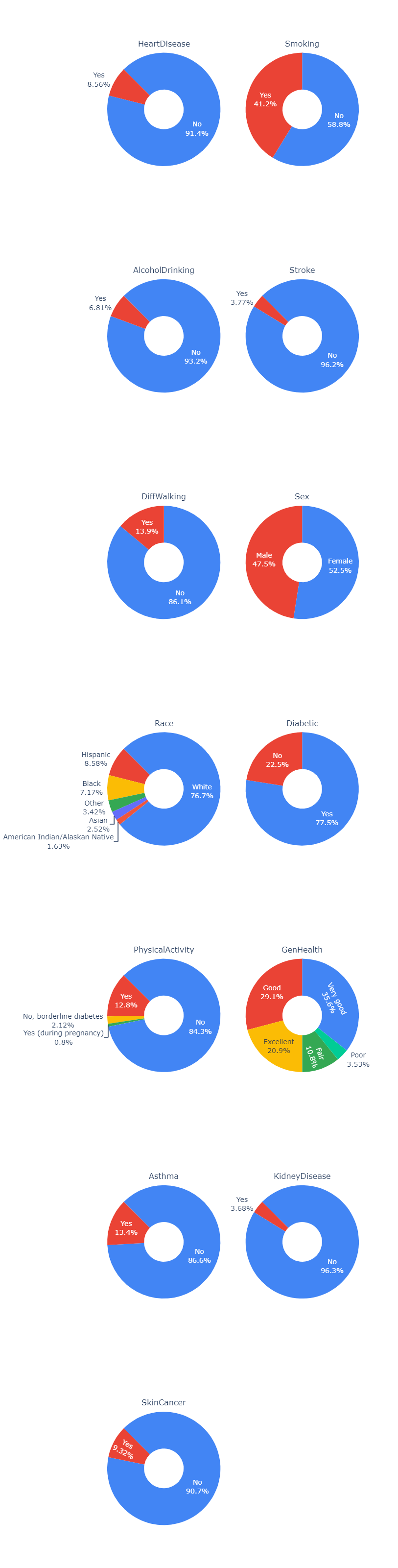
We first took a look into the data that we had access to and broke it down to see what the distributions of each feature looked like.
We see that in our data the amount of people that have heart disease, kidney disease and smoking are significantly less that those that do not have those diseases. Because of this we need to take into account that the information on those that do have any of the diseases are much more prone to have their feature sets have much larger weights than those of people that do not have the diseases. This will become especially apparant in our modeling methods.
Other interesting things that we saw were the large presense of smokers, the minimal amount of alcohol drinking, and asthma. We also saw in terms of demographics that there was a relatively equal size of male to female ratio, but a predominantly white demographic for race. While there is a solid proportion of people that said they had excellent, good or very good physical health, very few actively engaged in physical activity.
from IPython.display import Image
Image(filename='figures/pie_chart.png')
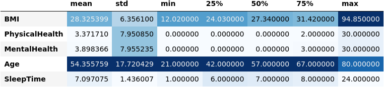
Here we wanted to look closer at the actual distributions with more specific information. We only chose to look at a subset of five features that held the larger amount of importance in affecting the labels of the dataset.
In figure (2) below, you can see the mean, standard deviation and the quantiles of the data for each of the five features.
Image(filename='figures/numerical_summary.png')
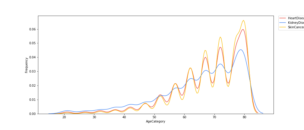
We then looked at any possible correlations between Age and the various possible diseases that people could get and created a graph plotting the correlation between age an the frequency of the age group to get the specified disease in figure (2).
Findings: Here we see that as age goes up, we tend to see that the frequency at which an age group gets any of the diseases increases at a nearly quadratic rate. Whats interesting here is the way that the data fluctuates as age goes up in a near perfect pattern.
Image(filename='figures/contin_frequency.png')
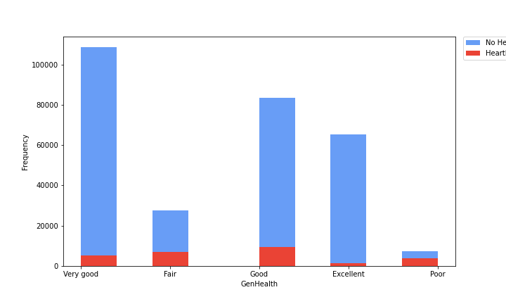
Here we continued to look at various comparisons of different features with a corresponding disease frequency for the subset of that feature. In the previous figure we looked at a continuous variable in age, but in this one we chose to look at discrete variables that are subset into categories. In this figure (3) we looked at the General Health of a person and the frequency at which they would have or not have heart disease in terms of the raw amount of people itself.
Findings: This graph shows that, if looking at the rough proportionality of no heart disease to heart disease ratios, very good and excellent but have much larger ratios of no heart to heart disease candidates, while as we go to good, and fair the proportions get worse, and at poor it gets to a nearly 1 to 1 ratio of no heart disease to heart disease. This makes sense in the larger context of health as a whole, as people who have generally less good health don’t have bodies that are as capable of fighting off various diseases and will have their heart and its condition erode faster than those that take care of it.
Image(filename='figures/heart_disease.png')
Results
To select the features, we used 3 different methods (Embedded Method, Filter Method, and Wrapper Method) and picked the majority ones. Using sklearn and the dataset, we created several different classifiers to predict the presence heart disease in an indivdual. Our classifiers included:
Decision Trees
Gaussian Naive Bayes
Logistic Regression
Gradient Boosting
We then calculated the corresponding accuracy as well as other metrics in the confusion matrix for each classifier and plotted them together, shown in the figure below. The process for creating these classifiers can be found in the accompanying model.ipynb notebook.
Image('figures/model_comparison.png')
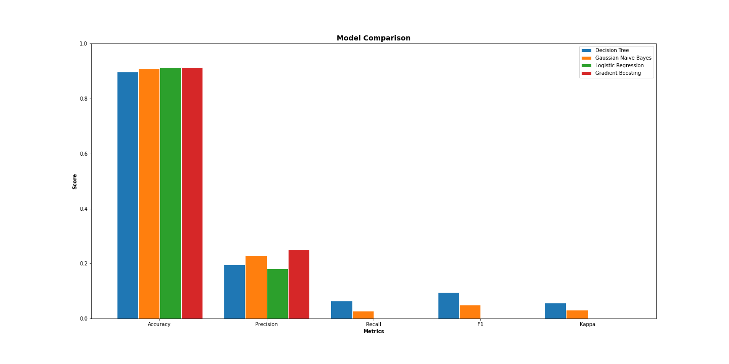
We found that the accuracy for the Logistic Regression and the Gradient Boosting were the highest while the Decision Tree classifier performed the worst. Additionally, we observe that Gradient Boosting performs the best by far in terms of precision.
Roc Curve
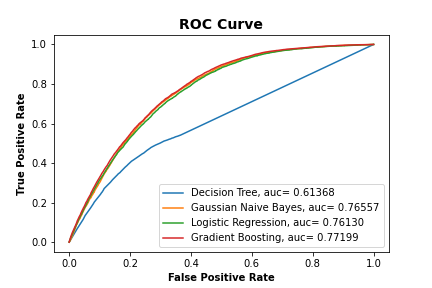
We also calculated what the ROC Curve would look like for each classifier and plotted them together to show how well each performed.
Results: We found that the ROC Curve for the Gaussian Naive Bayes, Logistic Regression and Gradient Boosting had similar aucs all being between .81 and .85, while the Decision Tree had very poor auc with it being close to .58, which is almost near .5 which is equivalent to randomly selecting values.
Image('figures/roc_curve.png')
Conclusion
Key Findings
From our EDA, we observed that not only does incidence of heart disease increase with age, but incidences of kidney disease and skin cancer exhibit a similar increasing trend. Additionally, we observed that people who self-report their health as poor have nearly a 1:1 incidence of heart disease. In terms of our classifiers, we found that the Logistic Regression and Gradient Boosting classifiers performed similarly in terms of accuracy. On the other hand, we found that the Decision Tree classifier performed the worst in terms of accuracy, recall, F1, and kappa.
Future Considerations
Logistic Regression vs. Gradient Boosting
Although our Logistic Regression and Gradient Boosting achieved similar accuracies, this does not imply that they are equally ubiquitous. As a step for future research, it could be interesting to explore under which specific cases Logistic Regression and Gradient Bossting outperform one another. Additionally, it should be considered that the Gradient Boosting classifier had much better precision by a considerable margin.
Features Used
As was mentioned in the Data Assumptions section, the dataset we worked with was narrowed down to just 18 features from nearly 300. The author of this dataset chose these 18 features at their own discretion, and did not provide a comprehensive explanation as to why the other 280~ features were exluded. To build more comprehensive classifiers, programmers should work closely with heart disease experts to see if any potentially important factors were excluded during this selection process.
Dataset Used
In the Data Assumptions section, it was mentioned how this dataset was derived from a telephone survey of the U.S. population. Because of biases inherent to this medium of communication (i.e. older people may be more likely to answer), the quality of this dataset should be investigated further. Ideally, future researchers could find another dataset with some of the same features as this one and build classifiers based off it, then observe how the classifiers for these datasets compare.